How to Choose Alphabet Educational Posters for Different Classroom Age Groups
Choosing alphabet educational posters looks simple until the classroom context is taken seriously. A preschool wall chart and a lower-primary phonics display may both feature the same 26 letters, but they do not serve the same teaching purpose, and they should not be evaluated the same way. For schools, distributors, education buyers, and researchers tracking classroom materials, the practical question is not whether alphabet posters are useful. It is which format is developmentally appropriate, durable enough for real use, visually effective at classroom distance, and aligned with the learning goals of a specific age group.
The market for classroom print materials has also changed. Buyers are no longer selecting only on appearance or unit price. They are increasingly weighing curriculum alignment, inclusive design, safety of materials, print longevity, multilingual needs, and the growing expectation that classroom visuals should support structured literacy rather than just decoration. In that context, selecting the right alphabet educational posters becomes a small but meaningful procurement decision.
Why age grouping matters more than poster style trends
A common mistake in poster selection is treating alphabet displays as generic classroom decor. In practice, younger learners and older early readers interact with wall materials very differently.
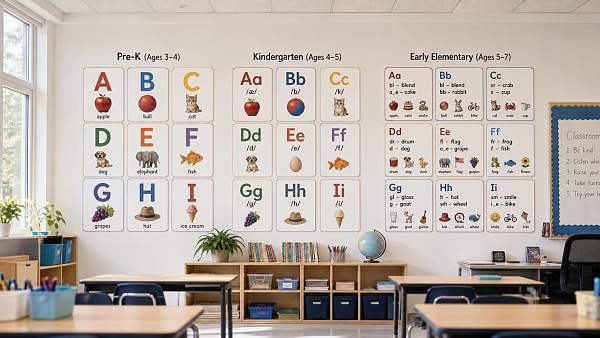
Children in preschool and pre-K usually use posters for visual exposure and recognition. They are not decoding text in a systematic way yet. They respond to large forms, strong contrast, familiar images, and repetition. For them, an alphabet poster works best as an anchor for teacher-led pointing, naming, singing, and sound association.
Kindergarten and early primary students move beyond passive recognition. They begin to connect letters with sounds, compare upper- and lowercase forms, and notice word patterns. At this stage, posters that looked attractive in a nursery setting may become too simplistic. If the display does not support phonemic awareness, beginning vocabulary, or letter formation, it has limited instructional value.
By Grade 2 and above, an alphabet poster should justify its wall space. Older students rarely need a purely decorative A-to-Z strip. What they may still benefit from is a more sophisticated reference tool: phonics patterns, spelling examples, morphology cues, bilingual support, or cursive/print comparison depending on the program.
This is why the decision should start with developmental function, not design trend. Neutral palettes, boho themes, or cartoon-heavy layouts may be visually fashionable, but they are secondary considerations if the poster does not match learner needs.
What to prioritize for preschool and nursery classrooms
For the youngest age groups, the best alphabet educational posters are usually the simplest. Buyers often overestimate how much information should be placed on one chart. In early childhood classrooms, too much visual density reduces usefulness.
Effective preschool posters typically share a few characteristics:
- Large, easily recognizable uppercase letters, sometimes paired with lowercase
- One familiar object per letter
- Bright but not chaotic color use
- Clear separation between each letter block
- Minimal background distraction
The object-image pairing matters more than many buyers assume. A poster may be graphically polished, but if it uses uncommon vocabulary to fit a design concept, its teaching value drops. “A for acorn” may work in one curriculum. “A for astronaut” may work in another. But highly abstract or culturally unfamiliar examples reduce immediate recognition. For multinational distribution or export procurement, image universality is worth checking during product evaluation.
Material safety is especially important in early childhood environments. If posters are intended for nurseries, kindergartens, or daycare spaces, buyers should verify substrate and ink safety claims with caution. Requirements vary by market, and any statement around child-safe materials, low-VOC printing, or relevant testing should be supported rather than assumed. Where claims cannot be confirmed, it is better to label them as 【待核实】 in internal sourcing notes.
Another overlooked point is viewing height. Preschool children rarely engage with posters placed according to adult eye level. A product may be excellent in print quality and still fail because it is installed too high for active referencing.
What changes in kindergarten: from recognition to phonics support
Kindergarten is where many alphabet poster decisions go wrong, because classrooms often sit between two models: early-childhood visual exposure and formal literacy instruction. Posters in this stage should ideally support both.
A useful kindergarten alphabet poster usually includes:
- Uppercase and lowercase letters together
- A clear letter-sound connection
- Simple word examples that teachers can reinforce orally
- Fonts that resemble instructional handwriting styles used in the classroom
Font choice deserves more attention than it usually gets. Decorative fonts may be attractive in catalogs, but if the letterforms differ from what children are taught to write or identify in beginner reading materials, confusion can follow. The lowercase “a” and “g” are common problem points. For buyers sourcing posters across regions, checking consistency with local literacy pedagogy is a practical step, not a cosmetic one.
Kindergarten teachers also benefit from modularity. Rather than a single crowded poster, some classrooms function better with coordinated letter cards, sound charts, and thematic supports. For procurement teams, this means evaluating whether a poster is being purchased as a standalone item or as part of a broader literacy wall system.
In other words, the best choice at this age is often not the most colorful poster. It is the one that works with how phonics is actually taught.
Lower primary classrooms need reference value, not just alphabet exposure
By Grades 1 to 3, children generally do not need to be reminded that the alphabet exists. They need supports that help them use it. This changes the evaluation criteria substantially.
In lower primary classrooms, posters earn their place when they reinforce decoding, spelling, pronunciation, or vocabulary building. This is where alphabet educational posters can evolve from basic letter charts into instructional tools.
Useful formats for this age group include:
- Alphabet posters with beginning sound examples that are phonetically regular
- Visuals linking letters to common digraphs or sound families where relevant
- Word-wall style alphabet headers for vocabulary organization
- Print and cursive comparison charts in regions where cursive is still taught
There is also a curriculum alignment issue here. If a school uses a structured phonics sequence, a generic A-to-Z animal poster may contribute very little. A more targeted set that corresponds to the actual sound sequence or spelling concepts being taught is usually more valuable, even if it appears less playful.
For bilingual or multilingual classrooms, selection becomes more nuanced. Some alphabet-image pairings work well in one language but create inconsistencies in another. In international school settings or export markets, this can affect product suitability. Buyers should consider whether the poster is intended for English-only literacy support, dual-language exposure, or a broader ESL/EFL environment.
Older elementary use cases are narrower but still relevant
Once students are fluent readers, traditional alphabet posters become far less central. That does not mean they disappear entirely. Their function simply changes.
In upper elementary classrooms, alphabet-related posters may still be selected for:
- Special education settings where foundational reinforcement remains useful
- Language-learning classrooms
- Reading intervention rooms
- Library or literacy-corner organization
At this level, design sophistication matters differently. Older students are less responsive to infantile visual language. Posters intended for intervention or ESL support should avoid looking juvenile if they are to remain usable in mixed-age settings. This is a known issue in educational materials procurement: content may be age-appropriate in skill level but socially inappropriate in presentation.
That distinction matters for institutions serving diverse learners. A poster that preserves learner dignity while supporting foundational literacy is usually the better long-term choice.
Design factors that affect real classroom performance
Across age groups, some selection criteria are consistently underestimated because they only become visible after installation.
Legibility at distance. A poster that looks sharp in a product image may be unreadable from the back of the room. Letter size, stroke thickness, spacing, and contrast all matter.
Surface finish. Glossy lamination can improve wipeability but may create glare under classroom lighting. Matte finishes often improve visibility, especially in rooms with strong daylight or overhead LEDs.
Durability. Temporary classroom posters and long-term institutional displays are different procurement categories. If materials are expected to last through repeated term cycles, edge curling, fade resistance, and cleanability should be assessed.
Mounting format. Rolled paper, card stock, laminated sheets, foam-backed panels, and magnetic classroom displays each suit different installation conditions. Buyers should match the substrate to the wall type, frequency of reuse, and storage conditions.
Visual load. Modern classrooms already contain a high density of instructional visuals. A poster does not exist in isolation. Products with excessive decorative elements may contribute to visual clutter, which some educators increasingly try to reduce, especially in early grades.
Procurement questions buyers should ask suppliers
For schools, wholesalers, or sourcing teams comparing suppliers, a few practical questions often reveal more than catalog aesthetics:
- What age band was this poster originally designed for?
- Was the content reviewed against any literacy framework or teacher input?
- What are the exact dimensions and recommended viewing distance?
- What printing method and substrate are used?
- Is the product intended for short-term seasonal use or multi-year classroom use?
- Are there region-specific English variants, bilingual versions, or customizable examples?
- What evidence supports any safety, eco-material, or compliance claims?
These questions matter because classroom posters are often sourced in bulk, bundled with broader educational supplies, or private-labeled for regional markets. A weak specification at this stage can lead to mismatched inventory that looks acceptable in packaging but performs poorly in schools.
Common selection mistakes in the current market
Several recurring mistakes show up across educational supply channels.
One is buying based on visual trend rather than instructional use. Soft-toned “aesthetic classroom” products have grown in popularity, but low-contrast designs can be harder for early learners to process.
Another is assuming more information always creates more value. Dense posters may appeal to adult buyers comparing features, yet younger students often learn better from cleaner layouts.
A third is neglecting regional teaching practice. Alphabet displays are not fully standardized across markets. Manuscript style, phonics emphasis, bilingual needs, and even preferred example vocabulary can differ significantly.
There is also a tendency to under-specify durability. In many institutions, classroom displays are handled repeatedly, exposed to cleaning protocols, and stored between terms. Posters chosen only for low upfront cost may generate higher replacement frequency.
How to make a sound age-group selection decision
A practical way to evaluate alphabet educational posters is to ask four questions in sequence.
What learning task should the poster support? Letter recognition, sound association, word reference, handwriting support, or bilingual reinforcement are different functions.
How old are the learners developmentally, not just administratively? A mixed-ability intervention room may need different materials from a mainstream class of the same nominal grade.
Will the poster be used actively or passively? Teacher-led reference charts should be optimized for visibility and clarity. Decorative perimeter strips can tolerate lighter instructional content.
What is the expected use life? This determines whether premium lamination, stronger board stock, or modular systems are justified.
When these questions are answered clearly, product comparison becomes more objective. The buyer is no longer choosing among pretty classroom prints, but among tools with different levels of instructional relevance.
Where the market is moving
The direction of the classroom poster segment is fairly clear. Even in low-tech classrooms, demand is shifting away from generic decoration and toward materials that can demonstrate educational purpose. Teachers and institutions increasingly want visual resources that align with literacy instruction, classroom calm, and inclusive learning design.
For suppliers and sourcing teams, this suggests that future-ready poster lines will likely perform better when they offer age-specific differentiation, region-aware content, better material transparency, and coherent literacy positioning rather than simply broader design variety.
That is the real takeaway for anyone evaluating this category. The right alphabet poster is not the one that covers the wall most attractively. It is the one that matches how a particular age group actually learns, how a classroom actually functions, and how a school actually buys.
Search News
Hot Articles
- Outdoor RidesHow to Select Leisure Park Equipment for Safe, High-Throughput Visitor AreasOct 03, 2026
- Fashion & Gem JewelryDiamond Tester Wholesale: How to Vet Accuracy, Calibration, and MOQ Before OrderingOct 02, 2026
- Hotel Room AmenitiesHow Hotels Can Choose Amenity Bottles That Balance Brand Image and Refill CostsOct 01, 2026
Popular Tags
Need ExpertConsultation?
Connect with our specialized leisureengineering team for procurementstrategies.
Recommended News
 Sep 21, 2026How Schools Can Cut Printing Costs When Buying Ink Cartridges in BulkSchool ink cartridges wholesale made smarter: cut printing costs with fleet planning, cost-per-page comparisons, reliable suppliers, and inventory controls.● Institutional Buyer
 Sep 17, 2026How to Source Wholesale Packing Tape Without Compromising Carton Seal StrengthWholesale packing tape sourcing guide: compare adhesive, backing, carton conditions, and real-world trials to reduce costs while maintaining reliable carton seal strength.● Institutional Buyer
 Sep 05, 2026How to Buy Geometry Sets in Bulk for Schools: A Practical Procurement ChecklistGeometry sets bulk buying guide for schools: compare safety, quality, compliance, packaging, supplier reliability, and total cost for smarter procurement.● Institutional Buyer
 Aug 31, 2026Microscope Slides Market Outlook: Demand Drivers, Segments, and Sourcing RisksExplore the microscope slides market: key demand drivers, product segments, quality risks, and sourcing strategies for reliable laboratory supply.● Institutional Buyer
 Aug 30, 2026Microscope Slides HS Code: How Importers Classify Laboratory Glass Slides CorrectlyMicroscope slides HS code guide: learn how to classify laboratory glass slides accurately, verify materials, avoid customs delays, and improve import compliance.● Institutional Buyer
 Aug 29, 2026How to Choose Graduation Tassels With Year Charms for Large School OrdersGraduation tassels with year charm: learn how to specify colors, materials, packaging, proofs, and delivery timelines for accurate large school orders.● Institutional Buyer
 Aug 11, 2026How to Choose Alphabet Educational Posters for Different Classroom Age GroupsAlphabet educational posters should match how each age group learns. Discover how to choose safer, clearer, curriculum-ready designs for preschool to primary classrooms.● Institutional Buyer
 Aug 05, 2026How to Evaluate a Marching Band Uniform Manufacturer for Quality and On-Time DeliveryMarching band uniform manufacturer selection starts with delivery risk. Learn how to compare quality, sizing, compliance, and capacity for reliable, on-time orders.● Institutional Buyer
 Jul 20, 2026How to Evaluate a Stationery Distributor for Bulk Office and School Supply PurchasingStationery distributor selection affects cost, delivery, and compliance. Learn how to evaluate suppliers for bulk office and school supply purchasing with confidence.● Institutional Buyer
 Jul 18, 2026How to Choose Custom Hotel Uniforms: Fabric, Branding, Comfort, and DurabilityCustom hotel uniforms guide: learn how to choose the right fabric, branding, comfort, and durability to improve staff performance, strengthen hotel image, and reduce long-term costs.● Institutional Buyer
 Jul 15, 2026How to Choose a Clear Pencil Cases Manufacturer for School and Retail OrdersClear pencil cases manufacturer selection made simple: learn how to compare quality, compliance, customization, pricing, and lead times for school and retail orders.● Institutional Buyer
 Jul 14, 2026How to Evaluate a Hole Punches Wholesale Supplier for Quality, MOQ, and Lead TimeHole punches wholesale supplier selection starts with quality, MOQ, and lead time. Learn practical checks, warning signs, and sourcing tips to reduce risk and buy smarter.● Institutional Buyer
 Jul 13, 2026Wholesale Erasers and Sharpeners: How to Compare Materials, Packaging, and MOQWholesale erasers and sharpeners buying guide: compare materials, packaging, and MOQ to cut risk, improve quality, and choose suppliers with better value.● Institutional Buyer
 Jul 10, 2026Custom Housekeeping Uniforms: What Fabrics and Features Hold Up in Daily Hotel Use?Custom housekeeping uniforms that last: discover the best fabrics, stretch, stain resistance, and hotel-ready features to cut replacement costs and keep staff polished daily.● Institutional Buyer
 Jul 08, 2026Fast Warm Up Laminator Buying Guide: Speed, Film Thickness, and Use Case ExplainedFast warm up laminator buying guide covering warm-up speed, film thickness, and real use cases. Compare specs, avoid buying mistakes, and choose the right model with confidence.● Institutional Buyer
 Jul 08, 2026How to Choose School Supplies for Campuses by Grade Level, Budget, and Daily UseSchool supplies for campuses made simple: learn how to choose by grade level, budget, durability, and daily use to reduce waste, improve sourcing, and support every classroom.● Institutional Buyer
 Jul 05, 2026How to Choose Branded Office Stationery for Corporate Use and Budget ControlBranded office stationery buying guide: learn how to balance quality, customization, supplier comparison, and budget control for consistent branding and smarter corporate sourcing.● Institutional Buyer
 Jul 01, 2026Paper Guillotines Buying Guide: Manual vs Electric, Cut Size, and Safety FeaturesPaper guillotines buying guide covering manual vs electric models, cut size, and safety features. Compare costs, productivity, and key specs to choose the right machine.● Institutional Buyer
 Jun 29, 2026Bingo Cages and Balls: Sizes, Materials, and What Affects Game VisibilityBingo cages and balls guide: compare sizes, materials, contrast, and durability to improve visibility, fairness, and long-term value in commercial and event play.● Institutional Buyer
 Jun 25, 2026School Uniforms in Europe: Materials, Sizing, and Compliance Points for Bulk OrdersSchool uniforms Europe sourcing guide: compare materials, sizing accuracy, and EU compliance points for bulk orders to reduce risk, improve durability, and choose suppliers with confidence.● Institutional Buyer
 Jun 23, 2026Wholesale Playing Cards Casino Buying Guide: Paper Stock, Finish, Security, and MOQWholesale playing cards casino buying guide covering paper stock, finish, security features, and MOQ. Compare suppliers smarter, reduce sourcing risk, and choose casino-grade decks with confidence.● Institutional Buyer
 Jun 22, 2026Eco Friendly Office Stationery: What to Check Before Buying for Daily Business UseEco friendly office stationery buying guide for businesses: learn how to check materials, certifications, durability, supplier reliability, and total cost before choosing daily office supplies.● Institutional Buyer
 Jun 21, 2026How to Choose Custom Promotional Pens for Trade Shows, Schools, and Corporate GiveawaysCustom promotional pens: learn how to choose the right styles for trade shows, schools, and corporate giveaways with tips on quality, branding, durability, and sourcing.● Institutional Buyer
 Jun 16, 2026Microscope Slides Wholesale Buying Guide: Glass Types, Sizes, and MOQ FactorsMicroscope slides wholesale buying guide covering glass types, standard sizes, MOQ factors, and quality risks—compare smarter, reduce waste, and choose reliable bulk supply.● Institutional Buyer