Fast-Casual Restaurant Interiors: Design Choices That Improve Speed and Guest Flow
Design for Throughput Before Atmosphere
Fast-casual restaurant interiors succeed when they make the next action obvious: where guests enter, where they queue, where they order, where they wait, where they collect food, and where they sit or leave. A polished dining room cannot compensate for a circulation plan that forces guests to cross paths with delivery riders, staff carrying hot food, or customers waiting for orders.
For project managers, the first question is therefore operational: what must happen in the space during the busiest fifteen minutes of service? The answer should drive the interior plan before finishes, decorative lighting, or seating density are finalized. Restaurant interiors for fast casual concepts are often expected to support dine-in, takeaway, app pickup, third-party delivery, self-service ordering, and staff restocking within a relatively compact footprint. Those functions compete for the same square meters unless they are deliberately separated.
The most effective projects treat speed as a spatial outcome rather than a staffing issue. Service can move quickly only when guests do not need to stop and interpret the room, employees have clear working routes, and waiting customers do not occupy the same paths used by people who have already ordered. This does not require every site to follow one layout. It does require the layout to reflect the restaurant's service model, peak order mix, and site constraints.
Start With the Guest Journey, Then Test the Staff Journey
A fast-casual guest journey is usually described as entry, menu review, ordering, payment, pickup, seating, and exit. On a floor plan, however, these stages are rarely as orderly as they sound. Some guests study the menu before joining the line. Some place digital orders before entering. Others arrive only to collect food. Families pause while deciding where to sit, while courier drivers may need a short but highly visible collection point.
Design teams should map each of these journeys as separate movement paths. The goal is not necessarily to keep every user apart, but to prevent conflicts at predictable pressure points. The most common failures occur at the front door, the ordering line, the pickup counter, and the route from pickup to seating.
A practical circulation review should answer the following questions:
- Can a first-time visitor see where to order within a few steps of entering?
- Can guests waiting for pickup stand without blocking people entering, exiting, or joining the queue?
- Does the route from the counter to seating cross a queue or pass through a staff service corridor?
- Can delivery drivers collect orders without entering the primary ordering line?
- Can employees replenish condiment stations, clear tables, and move waste without repeatedly cutting through guest traffic?
- Is there an obvious exit path for guests carrying trays, drinks, or multiple takeaway bags?
These questions should be tested against real occupancy, not an empty plan. A narrow aisle may look adequate until stools are occupied, coats are placed on chair backs, a stroller is parked beside a table, or several guests wait around the pickup shelf. The working dimension is the usable clear path under service conditions, not the distance measured between furniture symbols in a drawing.
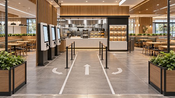
Queue design deserves particular attention because it affects both speed and perceived speed. A line that is visible, orderly, and steadily moving is often acceptable to guests. A line that spills into the entrance or overlaps with pickup creates uncertainty even when the actual wait time is short. In smaller locations, a simple guided queue can be more effective than a complicated system of barriers. The interior should communicate the sequence through counter placement, menu visibility, floor changes, lighting emphasis, and restrained signage rather than relying on freestanding signs to explain a confusing layout.
Separate Ordering From Collection Where the Order Mix Requires It
Not every fast-casual restaurant needs a dedicated pickup zone. For a concept with mostly counter orders and limited off-premise demand, a clearly marked handoff point beside the payment area may be sufficient. But once digital ordering and delivery collections become a meaningful share of peak activity, the same counter can become a bottleneck. Guests who have already paid occupy space beside customers still deciding what to order, and staff must call names, answer questions, and hand over bags across a congested edge.
A separate pickup zone can improve flow, but only if it is placed with the full sequence in mind. Positioning it directly beside the entrance may reduce congestion at the register, yet it can create a crowd at the door. Locating it too far from the production line may increase staff travel and delay handoff. The strongest layouts give pickup users a direct approach, a short waiting area, clear order identification, and a route out that does not require them to move against the main queue.
For project teams, the pickup area is also a coordination point between interior design, millwork, technology, and operations. Counter height, shelf depth, electrical provisions, order-display locations, bag storage, and visibility from the kitchen all need to be resolved early. A decorative wall niche added late in the project may look like a pickup area but still fail operationally if it provides no usable holding capacity or forces staff to turn away from the assembly line.
Self-order kiosks need the same discipline. They can shift ordering activity away from the primary counter, but they do not eliminate the queue; they redistribute it. Kiosks placed directly inside the entrance may create an immediate obstacle. Kiosks placed along a wall can work well when users have enough standing room and do not block access to seating, restrooms, or the pickup zone. Their screens also need to remain readable under the selected lighting conditions, especially where daylight, reflective surfaces, or glazed storefronts are prominent.
Use Seating as a Flow Tool, Not a Capacity Calculation
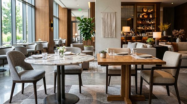
Dining capacity remains important, but maximizing the number of seats often produces the wrong result in fast-casual settings. A dense plan can reduce usable seating when guests avoid uncomfortable tables, cannot navigate with trays, or feel exposed to queue traffic. It may also increase cleaning time and make table turnover less predictable.
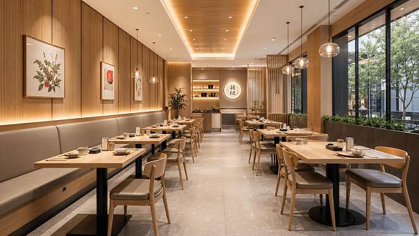
Seating should support different dwell times and party sizes. Counter seating, two-person tables, banquettes, communal tables, and limited flexible seating can each have a role, but their value depends on the concept. A lunch-led urban location may benefit from quick solo seating close to the exit. A family-oriented format may need more stable tables with room for high chairs and bags. A restaurant built around group sharing should avoid a layout dominated by fixed two-tops simply because they produce a favorable seat count on paper.
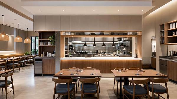
Zones are more useful than a uniform dining room. The area nearest the ordering and pickup activity can accommodate shorter stays and more resilient furniture. Quieter seating should sit beyond the primary circulation route, where guests are less likely to feel they are dining inside a corridor. Perimeter seating can use walls efficiently, but long uninterrupted banquettes may reduce flexibility if every party requires a different table size. A mix of fixed and movable furniture gives operations some ability to adjust, provided that the plan still maintains reliable clearance and does not depend on daily furniture rearrangement to function.
Table placement must also account for clearing and cleaning. Staff need a direct route to collect trays and wipe surfaces without squeezing between occupied chairs. If bussing stations are necessary, they should be accessible without becoming a visual focal point. Placing all waste, tray return, napkin, utensil, and water functions in one small area may appear efficient, but it can create a second queue after the meal. These stations should be located where guests naturally pass them while avoiding the main ordering line.
Choose Materials for Their Service Behavior
Material selection in fast-casual interiors is frequently framed as a choice between durable commercial finishes and a more distinctive brand environment. The better approach is to evaluate surfaces by how they behave during repeated service cycles: grease exposure, liquid spills, impacts from trays and carts, chair movement, frequent cleaning, temperature changes, and close inspection by guests.
A finish can be technically durable yet still create operational friction. Highly textured flooring may trap debris and complicate cleaning. Dark matte tabletops can show grease marks and dried residue. Open shelving can display merchandise attractively while collecting dust and creating another maintenance requirement. Light-colored upholstery can soften acoustics but may not be appropriate in zones with heavy turnover or self-service traffic.
Specify materials by zone rather than selecting one visual language and applying it everywhere. Entry and queue areas need resilient flooring with suitable slip resistance and straightforward cleaning. Counter fronts should withstand contact from bags, footwear, carts, and cleaning equipment. Dining tables need edges and surfaces that tolerate repeated wiping without premature wear. Wall finishes behind condiment points, beverage stations, and waste areas should resist staining and allow practical maintenance.
Details are as important as primary materials. Unprotected corners, shallow ledges, exposed base conditions, and decorative joints can become dirt traps or impact points. When the project includes custom millwork, review how panels can be repaired or replaced after damage. A large monolithic feature may look clean at handover but become expensive to maintain if a small impact requires replacement of an entire face.
The right material package also supports construction control. Standardized tile sizes, repeatable wall protection details, available repair components, and clearly defined mock-up expectations can reduce late substitutions and inconsistent installation across multiple sites. For multi-unit programs, this is often more valuable than a highly customized finish that looks impressive in a flagship but proves difficult to source or reproduce elsewhere.
Control Noise Without Making the Room Feel Closed In
Fast service generates sound: grinders, blenders, kitchen equipment, music, conversations, chairs, packaging, order calls, and delivery notifications. Hard surfaces are often chosen for durability and visual clarity, but an all-hard interior can become exhausting during peak hours. Noise affects perceived crowding, communication at the counter, and the ability of staff to hear order details.
Acoustic treatment works best when distributed across the room rather than hidden in one decorative feature. Ceiling treatments, wall panels, upholstered banquettes, acoustic baffles, and selected soft finishes can reduce reverberation while preserving a commercial, easy-to-clean environment. Their placement should correspond to noise sources and seating zones. A treatment located only at the back of the dining area will do little for a loud ordering zone at the front.
Lighting should reinforce the same operational hierarchy. Brighter, more direct illumination around menus, ordering points, pickup counters, and self-service areas helps guests complete tasks quickly. Dining areas can be more comfortable without becoming dim. Excessively low ambient light may look atmospheric in renderings but can make cleaning, wayfinding, menu reading, and food presentation harder. Conversely, uniformly bright lighting across every zone can make the room feel exposed and reduce the distinction between ordering, waiting, and dining.
Lighting controls should also match operating rhythms. The restaurant may need different settings for morning preparation, lunch service, evening trade, cleaning, and maintenance. Fixtures over tables, counters, and circulation paths should be evaluated for glare from typical guest positions and for whether replacement can be completed without disrupting the ceiling or adjacent finishes.
Protect the Project From Late Operational Changes
Many fast-casual interior problems are not caused by poor design intent. They emerge when operational decisions change after the layout has been coordinated: more digital orders than expected, an added beverage program, a revised menu requiring more counter equipment, a delivery platform requirement, or a decision to introduce table service during quieter periods. By that stage, the plan may have little spare capacity.
Project managers can reduce this risk by identifying the operational assumptions that affect the interior before design freeze. These include the expected order channels, pickup process, menu display method, staffing positions, tray use, clearing process, delivery collection policy, and the proportion of guests expected to dine in. Each assumption should have an owner. A floor plan cannot resolve uncertainty if the operating model itself remains undecided.
It is also useful to test the design through short scenario reviews rather than relying only on drawings. Walk through a peak lunch period, a delivery-heavy period, a guest with limited mobility, a maintenance task, a waste collection run, and a closing shift. The aim is to identify where people stop, turn, wait, carry, clean, or reach. Those moments expose the practical weaknesses that elevations and finish boards cannot show.
Fast-casual interiors do not need to choose between a strong brand expression and efficient service. The successful balance comes from assigning design effort to the places where the operation is felt most directly: the entry decision, the queue, the handoff, the route to seating, the table-clearance path, and the surfaces that absorb daily wear. When those conditions are resolved early, the restaurant can feel composed even at its busiest, which is a more convincing expression of the brand than decoration alone.
Search News
Hot Articles
- Restaurant FurnitureFast-Casual Restaurant Interiors: Design Choices That Improve Speed and Guest FlowOct 04, 2026
- Outdoor RidesHow to Select Leisure Park Equipment for Safe, High-Throughput Visitor AreasOct 03, 2026
- Fashion & Gem JewelryDiamond Tester Wholesale: How to Vet Accuracy, Calibration, and MOQ Before OrderingOct 02, 2026
Popular Tags
Need ExpertConsultation?
Connect with our specialized leisureengineering team for procurementstrategies.
Recommended News
 Oct 04, 2026Fast-Casual Restaurant Interiors: Design Choices That Improve Speed and Guest FlowRestaurant interiors for fast casual brands: discover design choices that improve guest flow, speed service, streamline pickup, and elevate every visit.● Hospitality Sourcing Dir
 Aug 31, 2026Do Supplier Product Specifications Always Match Design Drawings?Do product specs from suppliers always match design drawings? Discover how to prevent costly mismatches with revision control, shop drawings, samples, tolerances, and inspections.● Hospitality Sourcing Dir
 Jul 25, 2026How to Plan Restaurant Commercial Space Design for Better Workflow and Guest ExperienceRestaurant commercial space design starts with workflow, not style. Learn how to improve kitchen flow, guest comfort, and service efficiency with smarter restaurant planning.● Hospitality Sourcing Dir
 Jul 14, 2026Low Maintenance Hotel Outdoor Furniture: Best Materials for Poolsides, Patios, and RooftopsLow maintenance hotel outdoor furniture guide: discover the best materials for poolsides, patios, and rooftops to cut upkeep, improve durability, and elevate guest appeal.● Hospitality Sourcing Dir
 Jul 13, 2026FDA Rule Tightens Coating Tests for Restaurant FurnitureFDA Rule Tightens Coating Tests for Restaurant Furniture: learn how the 2026 FDA migration testing update may impact exports, compliance timelines, suppliers, and U.S.-bound orders.● Hospitality Sourcing Dir
 Jun 13, 2026How to Choose Hotel Outdoor Furniture for Pools, Patios, and Resort TerracesHotel outdoor furniture buying guide for pools, patios, and resort terraces. Learn how to balance durability, comfort, safety, and style for smarter hospitality sourcing.● Hospitality Sourcing Dir
 Jun 01, 2026How to choose folding event tables that last?Folding event tables buying guide: compare materials, load ratings, storage, safety, and supplier checks to choose durable tables for venues, schools, catering, and events.● Hospitality Sourcing Dir
 May 08, 2026Poker Tables Wholesale: MDF or Solid Wood for Heavy Use?Poker tables wholesale guide: compare MDF vs solid wood for heavy-use casinos, hotels, and events. Learn which build delivers durability, lower maintenance, and better ROI.● Hospitality Sourcing Dir
 May 06, 2026Indoor bleachers seating: fixed or retractable for tighter spaces?Indoor bleachers seating for tight spaces: compare fixed vs. retractable options for schools and multipurpose venues, with insights on safety, flexibility, lifecycle value, and smarter project planning.● Hospitality Sourcing Dir
 May 06, 2026Outdoor stadium seating mistakes that raise maintenance costsOutdoor stadium seating mistakes can quietly raise maintenance costs. Learn how better material, drainage, fixing, and service planning cuts repairs and protects long-term venue value.● Hospitality Sourcing Dir
 May 04, 2026Wholesale LED Menu Boards: Brightness Is Not the Only MetricWholesale LED menu boards are about more than brightness. Discover how color consistency, viewing angle, power efficiency, and reliability impact long-term performance and smarter sourcing.● Hospitality Sourcing Dir
 May 04, 2026Digital Signage for Restaurants: What Drives Real Menu Sales?Digital signage for restaurants drives real menu sales through smarter content, screen placement, timing, and optimization. Learn what truly boosts upsells, AOV, and menu performance.● Hospitality Sourcing Dir
 May 03, 2026Hotel pool lounge chairs: materials that survive sun and chlorineHotel pool lounge chairs buying guide: compare aluminum, resin, sling, and hardware materials that resist sun, chlorine, and heavy use for longer life and lower maintenance.● Hospitality Sourcing Dir
 May 03, 2026Outdoor rattan dining sets: which weave lasts in commercial useOutdoor rattan dining sets: discover which commercial weave lasts longest. Compare flat vs half-round options for durability, cleaning efficiency, and lower lifecycle cost.● Hospitality Sourcing Dir
 May 03, 2026Commercial patio umbrellas need more than UV fabric outdoorsCommercial patio umbrellas need more than UV fabric. Discover how wind stability, corrosion resistance, frame strength, and maintenance impact safer, longer-lasting outdoor projects.● Hospitality Sourcing Dir
 May 02, 2026Folding event tables that stay stable on uneven banquet floorsFolding event tables that stay stable on uneven banquet floors help reduce wobble, speed setup, and improve guest experience. Discover key features buyers should compare.● Hospitality Sourcing Dir
 May 02, 2026Banquet chairs wholesale: stacking height can change storage costsBanquet chairs wholesale decisions should consider stacking height, because smarter storage, faster handling, and lower transport costs can significantly improve long-term venue profitability.● Hospitality Sourcing Dir
 May 02, 2026When wholesale melamine plates look premium and when they do notWholesale melamine plates can look refined or cheap. Learn how finish, weight, design, and supplier quality affect premium appeal before you source for hospitality or retail.● Hospitality Sourcing Dir
 May 01, 2026Restaurant Booth Seating That Saves Space Without Feeling TightRestaurant booth seating that saves space without feeling cramped—discover smart dimensions, durable specs, and layout tips to boost comfort, traffic flow, and revenue.● Hospitality Sourcing Dir
 May 01, 2026How to Choose Commercial Bar Stools for High-Traffic VenuesCommercial bar stools for high-traffic venues: learn how to compare durability, safety, comfort, maintenance, and supplier reliability to choose seating that lasts and performs.● Hospitality Sourcing Dir
 Apr 28, 2026Why Hotel Tables Often Fail at Edges, Bases, and Surface FinishHotel tables often fail at edges, bases, and surface finish. Compare hotel furniture, custom furniture, luxury furniture, hotel chairs, hotel beds, and hotel equipment before you buy.● Hospitality Sourcing Dir
 Apr 28, 2026Hotel Tables With Stone Tops or Wood Tops: Which Performs Better?Hotel tables with stone tops or wood tops? Compare ROI, durability, and style across hotel furniture, custom furniture, hotel chairs, and hotel beds to choose smarter.● Hospitality Sourcing Dir
 Apr 28, 2026The Best Hotel Chairs Balance Comfort, Stackability, and DurabilityHotel chairs that balance comfort, stackability, and durability. Explore hotel furniture, custom furniture, hotel tables, hotel beds, and luxury furniture solutions for hospitality buyers.● Hospitality Sourcing Dir
 Apr 28, 2026Hotel Chairs: What Causes Wobbling, Cracks, and Early Wear?Hotel chairs buying guide: learn what causes wobbling, cracks, and early wear, and how to compare hotel furniture, custom furniture, hotel tables, hotel beds, and luxury furniture for lasting value.● Hospitality Sourcing Dir