How to Plan Restaurant Commercial Space Design for Better Workflow and Guest Experience
How to Plan Restaurant Commercial Space Design for Better Workflow and Guest Experience
Effective restaurant commercial space design is not decided by style boards or seating counts alone. The real test comes at 12:30 p.m. when the pass is full, delivery riders are waiting at the side door, dish racks are backing up near the wash area, and a guest still expects a calm dining room. A layout that looks generous on paper can fail quickly if circulation paths cross too often, if hot food travels too far before service, or if storage is treated as leftover space instead of an operational system.
That is why the strongest restaurant layouts usually begin with movement, not decoration. Before finishes, lighting, or front-of-house detailing, project teams need to understand who moves through the space, what they carry, how often they turn, where delays accumulate, and which areas must stay separated for safety and sanitation. In restaurant commercial space design, the planning question is rarely “How much area does the kitchen need?” It is more often “What kind of kitchen does this menu, service model, and site condition actually allow?”
Start with the service model, because it changes everything
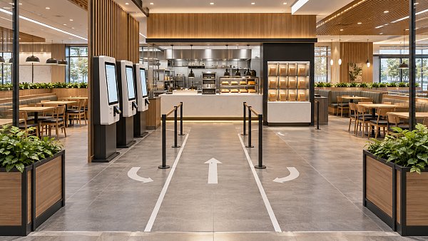
A fine dining restaurant, a fast-casual concept, and a delivery-heavy urban kitchen may all serve similar food categories, yet their space logic is fundamentally different. Fine dining usually needs controlled pacing, quiet guest circulation, and a kitchen line built around plating precision. Fast casual puts more pressure on queue management, visible ordering, and rapid handoff. Delivery-led formats often need a separate pickup sequence altogether, otherwise riders end up colliding with dine-in guests and servers.
This is where many projects go off track. Teams sometimes borrow a layout logic from another restaurant type because the footprint seems comparable. In practice, a 200-square-meter venue with 70 dine-in seats behaves very differently from a 200-square-meter venue that processes steady takeaway volume and high-frequency app orders. The latter may need less decorative frontage and more transitional space for bagging, staging, and courier collection. If those functions are pushed into aisles or cashier zones, the guest experience deteriorates even before the food quality becomes a factor.
The right planning sequence is usually menu first, service flow second, equipment mapping third, and only then detailed area allocation. Reverse that order and the design starts compensating for the building instead of supporting the operation.
The kitchen is a workflow engine, not a back-room utility
In working restaurants, the kitchen rarely fails because one appliance is undersized. More often, it fails because prep, cooking, plating, warewashing, and receiving were arranged as isolated blocks without considering how one task interrupts another. Staff then create unofficial shortcuts: storing items in the wrong place, parking racks in corridors, or using the handoff counter as temporary prep space. Those are not merely housekeeping issues. They usually indicate that the original space planning did not match real production rhythm.
A practical kitchen plan should separate at least four forms of movement: incoming goods, raw prep, finished dish dispatch, and dirty return. The exact degree of separation depends on concept size and local code requirements, but the principle holds across formats. When clean and dirty flows overlap too often, labor becomes more reactive, sanitation control becomes harder, and service speed becomes inconsistent.
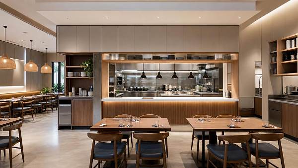
Open kitchens add another layer. They can strengthen the dining experience, especially where culinary theatre is part of the brand, but they also expose acoustic, thermal, and visual discipline problems. If exhaust noise is high, if plate storage is visible but disorganized, or if the chef path to service cuts across guest sightlines, the openness starts working against the concept. In those projects, restaurant commercial space design has to balance spectacle with operational containment. The question is not whether the kitchen is visible. It is whether visibility can be maintained under peak load without showing stress.
Front-of-house comfort is often won in the invisible zones
Guests usually describe a restaurant as comfortable, smooth, or chaotic without being able to identify why. Much of that impression comes from spaces they barely notice: the width of the approach to the host stand, the distance between the service station and the farthest table, the location of the restroom corridor, the amount of noise escaping from the dish area, and whether waiting guests clog the main entry.
A common design mistake is treating every square meter visible to guests as revenue-generating and every support area as reducible. That may improve seating count on a spreadsheet, but it often weakens table turn quality and staff response time. A cramped server station means longer reset cycles. A poorly placed POS terminal creates queue spillover. Banquette seating that looks efficient may reduce accessibility or make table service awkward if clearances were optimized too aggressively.
The strongest dining rooms are usually planned with different tempo zones. Near the entrance, the design may need a more forgiving circulation width because arrivals, departures, payment, and takeaway interactions overlap. Deeper inside the dining area, guests usually value visual calm and fewer interruptions. That is why not every table should have equal proximity to service routes. Some should. Some should be protected from them.
Site conditions will overrule generic layout advice
There is no universal back-of-house ratio or “ideal” seating formula that survives every project. Existing columns, slab penetrations, grease exhaust routing, landlord restrictions, floor loading, and utility entry points can reshape the plan far more than concept sketches suggest. In retrofit projects, especially in mixed-use commercial buildings, the available shaft position for ventilation and drainage often determines where the hot line and wash area can realistically go.
This matters early. If the concept assumes heavy frying, high-temperature wok cooking, or large-volume baking, the mechanical and exhaust implications need to be checked before the customer journey is polished. Otherwise the project may end up forcing major equipment into compromised positions simply because duct routes, make-up air, or power capacity were treated as engineering details to resolve later.
Heritage buildings and compact urban sites bring different constraints. Ceiling height may limit hood configuration. Narrow frontage may compress waiting and cashier functions. Basement prep or storage areas may seem attractive until vertical transport becomes a bottleneck during delivery windows. None of these issues make a project unworkable, but they do change what “efficient” means. A sound design response is not the same as imposing a standard prototype onto a difficult shell.
Where projects usually underestimate risk
The biggest planning errors tend to cluster around assumptions that seem minor during design review:
These checks are not glamorous, but they often separate a durable layout from a fragile one. Once a restaurant opens, circulation problems are expensive to correct because they are tied to fixed services, millwork, and production routines.
Different dayparts may need different space behavior
Restaurants with breakfast, lunch, and evening programs often struggle because the design was optimized for only one trading period. A calm breakfast room may not have enough waiting capacity for lunch. A dinner-focused bar may interrupt takeaway pickup in the afternoon. The solution is not always more space. Sometimes it is better zoning, flexible furniture logic, or a clearer split between guest-facing functions and operational support.
This is particularly relevant in hotels, mixed-use developments, transport-adjacent locations, and institutional dining environments where demand patterns are uneven. In those projects, the question is not just peak capacity. It is whether the space can absorb sudden surges without changing character too abruptly. A restaurant that feels orderly at 40 covers and strained at 60 may not have a capacity problem in the strict sense; it may have a transition problem built into the layout.
Compliance and maintenance are design issues, not post-design checks
Safety, hygiene, accessibility, fire strategy, and equipment servicing should not be layered onto a nearly finished plan. Requirements vary by jurisdiction, so project teams need local code review and specialist coordination, but the broad lesson is consistent: every inaccessible valve, every hard-to-clean corner, and every congested egress route eventually becomes an operating cost.
Maintenance access is especially easy to underdesign. Refrigeration, ventilation, drainage points, grease management, and dishwashing infrastructure all need room for inspection and intervention. A compact layout that saves area during fit-out can become disruptive if routine maintenance requires moving furniture, interrupting service, or partially dismantling joinery. Good restaurant commercial space design plans for the sixth month of operation, not just opening week.
What experienced teams confirm before locking the plan
Before the layout is finalized, experienced operators and design teams usually pressure-test a few practical questions. Can two people work the key station at once without one backing into a hot surface? Can a full dish rack move to wash-up without crossing plated food? Where does a late delivery wait if receiving is occupied? What happens to guest circulation when six people are waiting to pay or collect takeaway? Those questions sound simple because they come from actual operation, not from presentation drawings.
If the answers are still vague, the layout is probably not ready. At that stage, a quick review with operations, kitchen planning, MEP coordination, and front-of-house management usually reveals more than another round of visual refinement. The best spaces are rarely the most complicated. They are the ones where every meter has a job, and where the guest experience improves because the workflow underneath it stays composed under pressure.
For restaurant owners, developers, and project teams, the practical next step is to test the plan against real service moments rather than ideal occupancy diagrams. Walk the breakfast rush, the lunch queue, the dish return, the delivery drop, and the last hour before close. That is where a restaurant space proves whether it was designed to look efficient or to actually operate that way.
Search News
Hot Articles
- Pro Stage AudioRME Launches ADI-2/4 PRO EX Audio Converter with Integrated ProcessingOct 24, 2026
- Office Furniture & EquipOffice Phone Booths: How to Evaluate Speech Privacy Before You BuyOct 24, 2026
- Outdoor RidesComcast Q3 Earnings: Universal Theme Park Revenue Falls 4.4% to $2.6 BillionOct 23, 2026
Popular Tags
Need ExpertConsultation?
Connect with our specialized leisureengineering team for procurementstrategies.
Recommended News
 Oct 23, 2026Hotel Bar Furniture Prices: What to Budget for Stools, Tables, and DeliveryCompare hotel bar furniture price allowances for stools and tables, plus delivery and installation costs. Build a realistic budget, spot hidden charges, and buy with confidence.● Hospitality Sourcing Dir
 Oct 16, 2026Buying Hotel Lobby Furniture Wholesale: MOQs, Freight Costs, and Lead TimesBuying hotel lobby furniture wholesale? Compare MOQs, freight costs, and lead times to avoid hidden fees, protect your opening date, and source smarter with this practical guide.● Hospitality Sourcing Dir
 Oct 04, 2026Fast-Casual Restaurant Interiors: Design Choices That Improve Speed and Guest FlowRestaurant interiors for fast casual brands: discover design choices that improve guest flow, speed service, streamline pickup, and elevate every visit.● Hospitality Sourcing Dir
 Aug 31, 2026Do Supplier Product Specifications Always Match Design Drawings?Do product specs from suppliers always match design drawings? Discover how to prevent costly mismatches with revision control, shop drawings, samples, tolerances, and inspections.● Hospitality Sourcing Dir
 Jul 25, 2026How to Plan Restaurant Commercial Space Design for Better Workflow and Guest ExperienceRestaurant commercial space design starts with workflow, not style. Learn how to improve kitchen flow, guest comfort, and service efficiency with smarter restaurant planning.● Hospitality Sourcing Dir
 Jul 14, 2026Low Maintenance Hotel Outdoor Furniture: Best Materials for Poolsides, Patios, and RooftopsLow maintenance hotel outdoor furniture guide: discover the best materials for poolsides, patios, and rooftops to cut upkeep, improve durability, and elevate guest appeal.● Hospitality Sourcing Dir
 Jul 13, 2026FDA Rule Tightens Coating Tests for Restaurant FurnitureFDA Rule Tightens Coating Tests for Restaurant Furniture: learn how the 2026 FDA migration testing update may impact exports, compliance timelines, suppliers, and U.S.-bound orders.● Hospitality Sourcing Dir
 Jun 13, 2026How to Choose Hotel Outdoor Furniture for Pools, Patios, and Resort TerracesHotel outdoor furniture buying guide for pools, patios, and resort terraces. Learn how to balance durability, comfort, safety, and style for smarter hospitality sourcing.● Hospitality Sourcing Dir
 Jun 01, 2026How to choose folding event tables that last?Folding event tables buying guide: compare materials, load ratings, storage, safety, and supplier checks to choose durable tables for venues, schools, catering, and events.● Hospitality Sourcing Dir
 May 08, 2026Poker Tables Wholesale: MDF or Solid Wood for Heavy Use?Poker tables wholesale guide: compare MDF vs solid wood for heavy-use casinos, hotels, and events. Learn which build delivers durability, lower maintenance, and better ROI.● Hospitality Sourcing Dir
 May 06, 2026Indoor bleachers seating: fixed or retractable for tighter spaces?Indoor bleachers seating for tight spaces: compare fixed vs. retractable options for schools and multipurpose venues, with insights on safety, flexibility, lifecycle value, and smarter project planning.● Hospitality Sourcing Dir
 May 06, 2026Outdoor stadium seating mistakes that raise maintenance costsOutdoor stadium seating mistakes can quietly raise maintenance costs. Learn how better material, drainage, fixing, and service planning cuts repairs and protects long-term venue value.● Hospitality Sourcing Dir
 May 04, 2026Wholesale LED Menu Boards: Brightness Is Not the Only MetricWholesale LED menu boards are about more than brightness. Discover how color consistency, viewing angle, power efficiency, and reliability impact long-term performance and smarter sourcing.● Hospitality Sourcing Dir
 May 04, 2026Digital Signage for Restaurants: What Drives Real Menu Sales?Digital signage for restaurants drives real menu sales through smarter content, screen placement, timing, and optimization. Learn what truly boosts upsells, AOV, and menu performance.● Hospitality Sourcing Dir
 May 03, 2026Hotel pool lounge chairs: materials that survive sun and chlorineHotel pool lounge chairs buying guide: compare aluminum, resin, sling, and hardware materials that resist sun, chlorine, and heavy use for longer life and lower maintenance.● Hospitality Sourcing Dir
 May 03, 2026Outdoor rattan dining sets: which weave lasts in commercial useOutdoor rattan dining sets: discover which commercial weave lasts longest. Compare flat vs half-round options for durability, cleaning efficiency, and lower lifecycle cost.● Hospitality Sourcing Dir
 May 03, 2026Commercial patio umbrellas need more than UV fabric outdoorsCommercial patio umbrellas need more than UV fabric. Discover how wind stability, corrosion resistance, frame strength, and maintenance impact safer, longer-lasting outdoor projects.● Hospitality Sourcing Dir
 May 02, 2026Folding event tables that stay stable on uneven banquet floorsFolding event tables that stay stable on uneven banquet floors help reduce wobble, speed setup, and improve guest experience. Discover key features buyers should compare.● Hospitality Sourcing Dir
 May 02, 2026Banquet chairs wholesale: stacking height can change storage costsBanquet chairs wholesale decisions should consider stacking height, because smarter storage, faster handling, and lower transport costs can significantly improve long-term venue profitability.● Hospitality Sourcing Dir
 May 02, 2026When wholesale melamine plates look premium and when they do notWholesale melamine plates can look refined or cheap. Learn how finish, weight, design, and supplier quality affect premium appeal before you source for hospitality or retail.● Hospitality Sourcing Dir
 May 01, 2026Restaurant Booth Seating That Saves Space Without Feeling TightRestaurant booth seating that saves space without feeling cramped—discover smart dimensions, durable specs, and layout tips to boost comfort, traffic flow, and revenue.● Hospitality Sourcing Dir
 May 01, 2026How to Choose Commercial Bar Stools for High-Traffic VenuesCommercial bar stools for high-traffic venues: learn how to compare durability, safety, comfort, maintenance, and supplier reliability to choose seating that lasts and performs.● Hospitality Sourcing Dir
 Apr 28, 2026Why Hotel Tables Often Fail at Edges, Bases, and Surface FinishHotel tables often fail at edges, bases, and surface finish. Compare hotel furniture, custom furniture, luxury furniture, hotel chairs, hotel beds, and hotel equipment before you buy.● Hospitality Sourcing Dir
 Apr 28, 2026Hotel Tables With Stone Tops or Wood Tops: Which Performs Better?Hotel tables with stone tops or wood tops? Compare ROI, durability, and style across hotel furniture, custom furniture, hotel chairs, and hotel beds to choose smarter.● Hospitality Sourcing Dir